US 2020 Presidental Election and Rural - Urban Divide
Introduction
The US Presidential vote count has nearly finished. Trump is fighting the results in court though appears to have lost, but a clear theme that’s coming out is the contrast of rural and urban voters. The theory seems to go: Trump voters for the most part come from rural areas, and the election is based on a rural vs urban debate. We can test this theory using some data science approaches - mainly, cleaning and merging data from several places into a useful format. For this post, we’ll be addressing the research question:
Did Trump’s backing come from only rural areas and could it swing the election in his or future candidates favour?
Let’s first load our libraries and get started!
# For data wrangling/tables
library(tidyverse)
library(lubridate)
library(ggtext)
library(glue)
library(scales)
library(RColorBrewer)

# For mapping and census data
library(tigris)
library(leaflet)
library(leaflet.extras)
library(maps)
library(sf)
library(widgetframe)
library(htmlwidgets)
library(htmltools)
map <- purrr::map
As always I like to use a custom ggplot function specified below.
# a custom theme for ggplots
post_theme <- function(...) {
  theme(
    text =
      element_text(
        color = 'black',
         family = 'serif'),
    axis.text =
      element_text(
        color = 'black',
        size = 14),
    panel.background =
      element_blank(),
    axis.line.x =
      element_line(
        color = 'black'),
    axis.ticks = element_blank(),
    plot.margin = margin(.75, .75, .75, .75, 'cm'),
    plot.caption =
      element_text(hjust = 0,
                   size = 15,
                                face = "italic"),
    plot.title =
      element_text(
        face = 'bold'),
    plot.subtitle =
      element_text(face = 'bold'),
    plot.title.position = "plot",
    plot.caption.position =  "plot",
    strip.background =
      element_blank(),
    strip.text =
      element_text(
        face = 'bold')
  ) +
    theme(...) # this bit allows us to make changes using this same function instead of calling two theme functions.
}
The data
Our process for analysis is a two-step process: first, we download and tidy data for the US 2020 presidential election results; then, we’ll join this data to the USDA Rural-Urban classifications. The resulting database will be used to investigate voting patterns between these classifications.
Election data
Election data comes from Fabio Votta’s Github page, under the repository for favstats/USElection2020-NYT-Results (visit https://github.com/favstats/USElection2020-NYT-Results). Fabio is a fantastic political data scientist. I’d recommend following him on Twitter (@favstats) as he shares a lot of great information on his work there. Fabio wrote a function that communicates with the New York Times data API to pull the data in a tidy format.
I’ve already cloned into the favstats/USElection2020-NYT-Results repository and have the database of voting trends on my laptop. This repo has dated files with the election results as they come in. We’ll need a bit of code to help us identify the most recent version as it’s being updated. Below, is the code I used to input the data.
data_folders <- list.files('~/Documents/R/USElection2020-NYT-Results/data/')

max_date_folder <- data_folders %>%
  str_subset('^2020') %>%
  max()

results_2020 <- glue('~/Documents/R/USElection2020-NYT-Results/data/{max_date_folder}') %>%
  list.files(full.names = T) %>%
  str_subset('presidential$') %>%
  list.files(full.names = T) %>%
  str_subset('.csv$') %>%
  read_csv()
USDA Rural-Urban Classifications
The USDA’s Rural-Urban Classification’s classify each US county along a rural-urban continuum. We’ve used these codes quite a lot when dealing with US county-level data. You can find this data here for download, https://www.ers.usda.gov/data-products/rural-urban-continuum-codes.aspx.
In addition, we’re going to use a few of R’s internal databases to help us out in the wrangling process, specifically we’ll use some data from the tigris package.
In the process of writing this blog post I’ve discovered that Alaska uses electoral districts for counting votes - not counties. Therefore, for now, we’re going to leave Alaska out of the analysis because assigning a rural-urban code to electoral districts requires quite a bit of GIS work that’s outwith the scope of this post.
# US county fips from tigris package
fips_codes <-
  fips_codes %>%
  as_tibble()


# Pull in the USDA data from a directory I created in my cloud storage.
rural_urban <-
  read_csv(
    '~/OneDrive - SRUC/Data/usda/ruralurbancodes2013.csv'
    ) %>%
  as_tibble() %>%
  select(state,
         county = county_name,
         rucc_2013,
         desc = description)
Data join
We need to join the election data, which has the county fips codes to identify each county, with the built-in county.fips database. Then, we have to join the election data with the new rural_urban_tidy data.
# clean names will be used to help get joining data in format that will merge well
clean_names <-
  function(x){
    x <- str_to_lower(x)
    x <- str_remove_all(x, 'county')
    x <- str_remove_all(x, '[[:digit:]]')
    x <- str_squish(x)
    x <- str_trim(x)
    x
  }


fips_codes_tidy <- fips_codes %>%
  mutate(county = clean_names(county)) %>%
  mutate(fips = glue('{state_code}{county_code}'))


rural_urban_tidy <- rural_urban %>%
  mutate(county = clean_names(county)) %>%
  left_join(fips_codes_tidy,
            by = c('state',
                   'county')) %>%
  select(fips,
         county,
         state = state_name,
         ru_ur_n = rucc_2013,
         ru_ur_label = desc)


results_2020_rural_urban <-
  results_2020 %>%
  inner_join(rural_urban_tidy %>%
               select(-state),
             by = 'fips')
Tidy and combine
We now have two datasets to work with:
- Our dataset containing the voting outcome
- Our dataset with the rural-urban codes
We’re going to transform our voting data to tidy format so we can join it with the rural-urban data.
During this process we’ll also make some adjustments to what will become our axis labels. Adding two asterisks (**) will signal the ggtext package to bold certian words in the ggplot.
ru_ur_partison_vote <-
  results_2020_rural_urban %>%
  select(ru_ur_label,
         ru_ur_n,
         results_bidenj,
         results_trumpd) %>%
  gather(key, partison_vote,
         -ru_ur_label, -ru_ur_n) %>%
  group_by(ru_ur_label) %>%
  mutate(total_ru_ur_vote = sum(partison_vote),
         key = str_remove_all(key, 'results_')
         ) %>%
  ungroup()


ru_ur_new_v <- c("**Urban** population of 2,500 to 19,999, not adjacent to a metro area", "**Urban** population of 2,500 to 19,999, adjacent to a metro area", "**Urban** population of 20,000 or more, not adjacent to a metro area", "Counties in **metro** areas of 250,000 to 1 million population", "Counties in **metro** areas of fewer than 250,000 population", "Counties in **metro** areas of 1 million population or more", "Completely **rural** or less than 2,500 urban population, adjacent to a metro area", "Completely **rural** or less than 2,500 urban population, not adjacent to a metro area", "**Urban** population of 20,000 or more, adjacent to a metro area") %>%
  str_replace_all(', not', '<br> not') %>%
   str_replace_all(', adjacent', '<br> adjacent')

ru_ur_partison_vote <- ru_ur_partison_vote %>%
  distinct(ru_ur_label) %>%
  mutate(ru_ur_label_new = ru_ur_new_v) %>%
  right_join(ru_ur_partison_vote) %>%
  select(ru_ur_label = ru_ur_label_new,
         ru_ur_n,
         key,
         partison_vote,
         total_ru_ur_vote)
Sub-setting for annotations
Adding annotations to a plot can really help drive home the main take-aways by drawing the reader’s eye to specific areas.
A key finding with our analysis, related to rural voting patterns, is that many people in urban areas voted Donald Trump. And because the urban areas have such a higher percentage of people living there it is much more impactful on the election outcome than rural areas.
We’re going to highlight those urban vote percentages and add them to geom_text in the ggplot function.
We can specify a new data set in that geom (separate from the primary data that’s being plotted in the main call).
bar_labels_df <- ru_ur_partison_vote %>%
  group_by(ru_ur_label, key) %>%
  summarise(tot_ru_ur_party =
           sum(partison_vote)) %>%
  mutate(percent_ru_ur_party =  percent(tot_ru_ur_party/sum(tot_ru_ur_party))
         ) %>%
  ungroup() %>%
  mutate(position_y = tot_ru_ur_party/2,
         position_done = ifelse(
           key == 'bidenj', position_y + lead(tot_ru_ur_party), position_y
         ))  %>%
  group_by(ru_ur_label) %>%
  mutate(tot = sum(tot_ru_ur_party)) %>%
  ungroup()
Our bar colours will split out by the proportion of a every level won by one of the two main candidates.
I searched the web and found the Republican party red and Democratic party blue. You can see these colours below.
show_col(c( '#0015BC', '#DE0100'))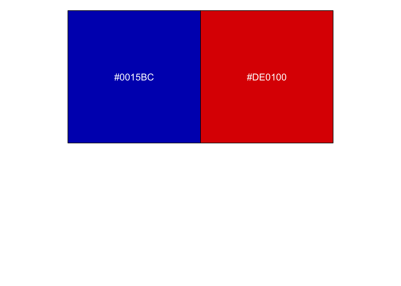 We can use these unique colours in the
 scale_fill_manual function.
Also, the label_number_si function from the scales package provides the clean looking axes labels.
# the scale_fill_manual requires a named vector, with the names corresponding to the levels to be filled
party_cols <- c( '#0015BC', '#DE0100')

names(party_cols) <- unique(ru_ur_partison_vote$key)
# for clean labels
gg_labs <- label_number_si(accuracy = 0.01)

gg_wrap <- function(width = 25){
  str_wrap(x, width)
}
Building the plot by layers
ggplot2 works by layering geoms on top of one another. This works to our advantage, as we can step through each additional plot layer at a time.
First, let’s create the base plot with data.
Note the use of mutate and fct_reorder to ensure our plot level order corresponds to the highest to lowest.
We’ll start with a simple bar plot.
(ru_ur_partison_vote_gg <-
    ru_ur_partison_vote %>%
  mutate(ru_ur_label =
           fct_reorder(
             ru_ur_label,
             total_ru_ur_vote),
         prefix = word(ru_ur_label, 1, 1)
         ) %>%
  ggplot(aes(ru_ur_label,
             partison_vote,
             fill = key))+
  geom_col(show.legend = F))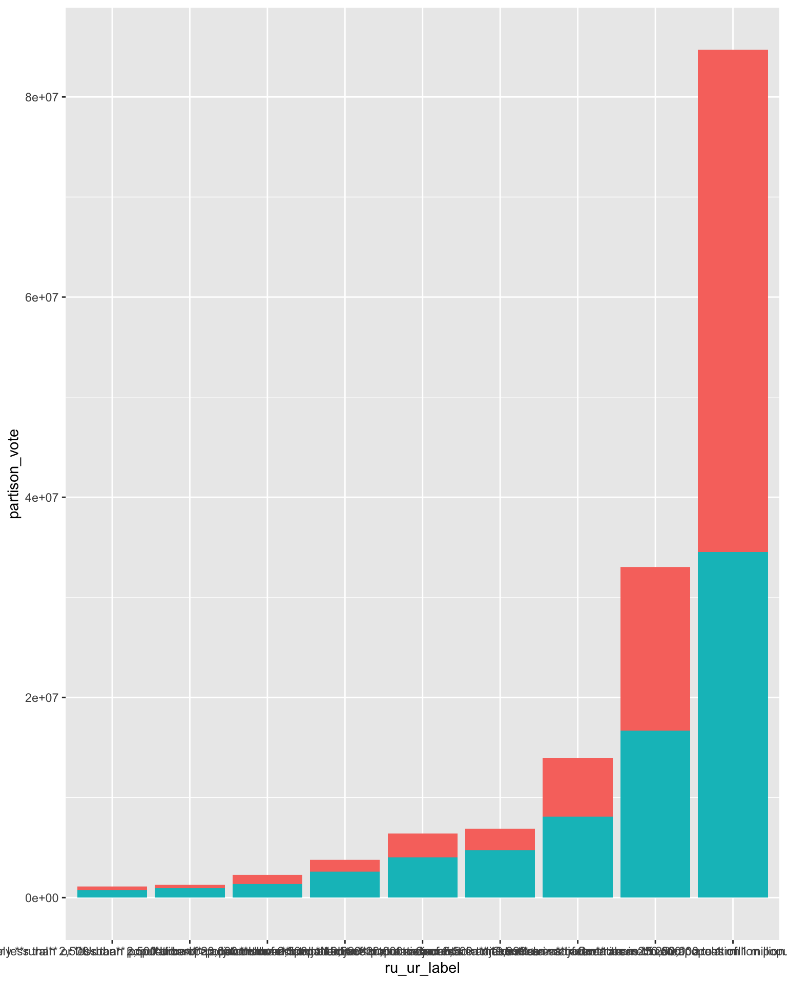
The plot above shows we’re on the right track, but for the most part it’s unreadable at the moment.
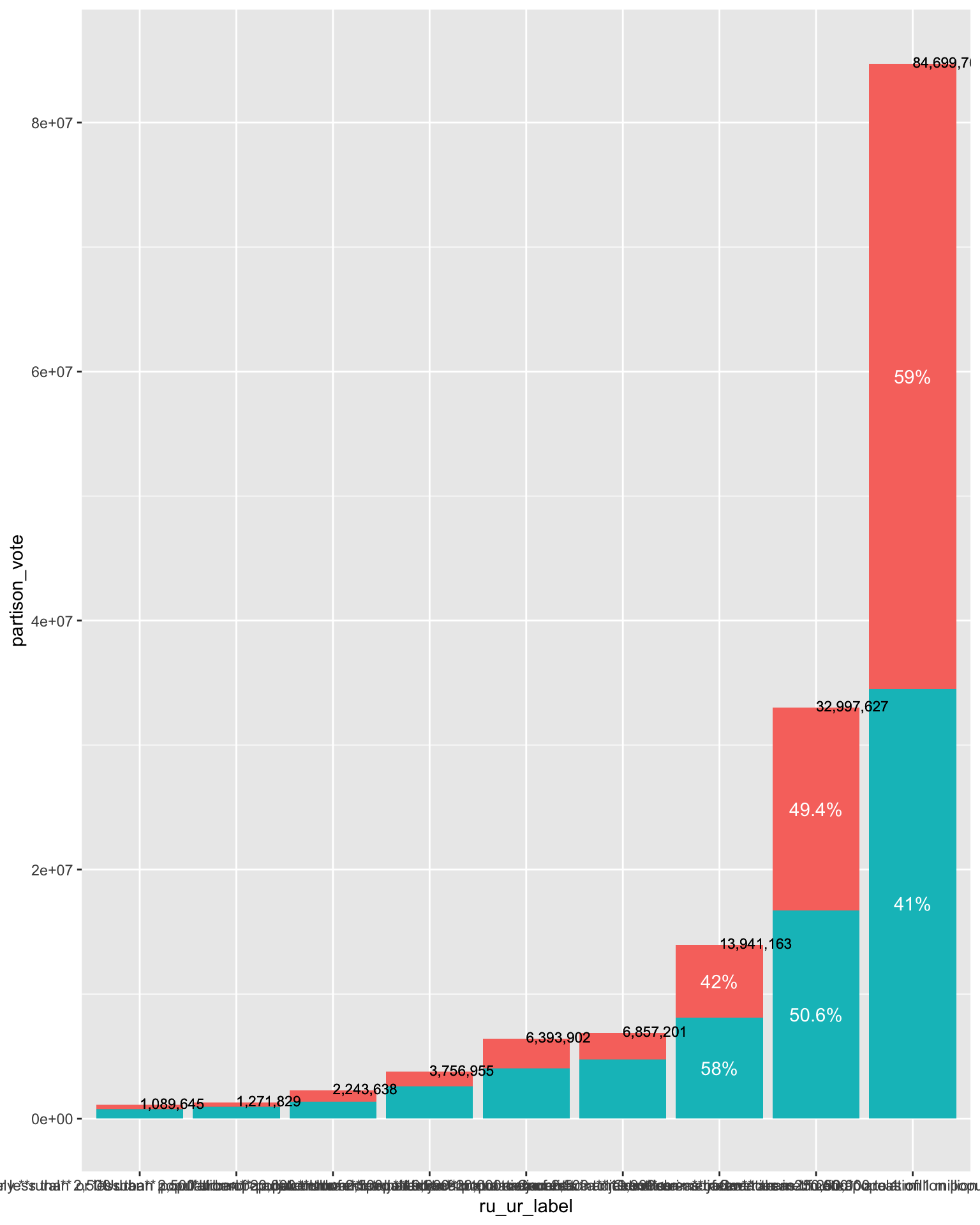
Before flipping the coordinates, we’re going to add the annotations to the plot.
These are contained in the bar_labels_df data.
(ru_ur_partison_vote_gg <-
  ru_ur_partison_vote_gg +
  geom_text(data = bar_labels_df %>%
              filter(str_detect(ru_ur_label,
                                '^Counties')) ,
            aes(x = ru_ur_label,
                y = position_done,
                label = percent_ru_ur_party),
            color = 'white')+
    geom_text(data  = bar_labels_df,
              aes(x = ru_ur_label,
                  y = tot+1.5e5,
                  label = comma(tot)),
                  hjust = 0,
              color = 'black',
              size = 3
              ))
Now we add the wow factor: the colours and label functions.
Also, the coord_flip call flips the chart on its side - were we can more easily see everything.
(ru_ur_partison_vote_gg <-
  ru_ur_partison_vote_gg  +
  scale_x_discrete(labels = function(x){str_wrap(x, 25)})+
  scale_y_continuous(labels = gg_labs)+
  scale_fill_manual(values = party_cols)+
  coord_flip(clip = 'off'))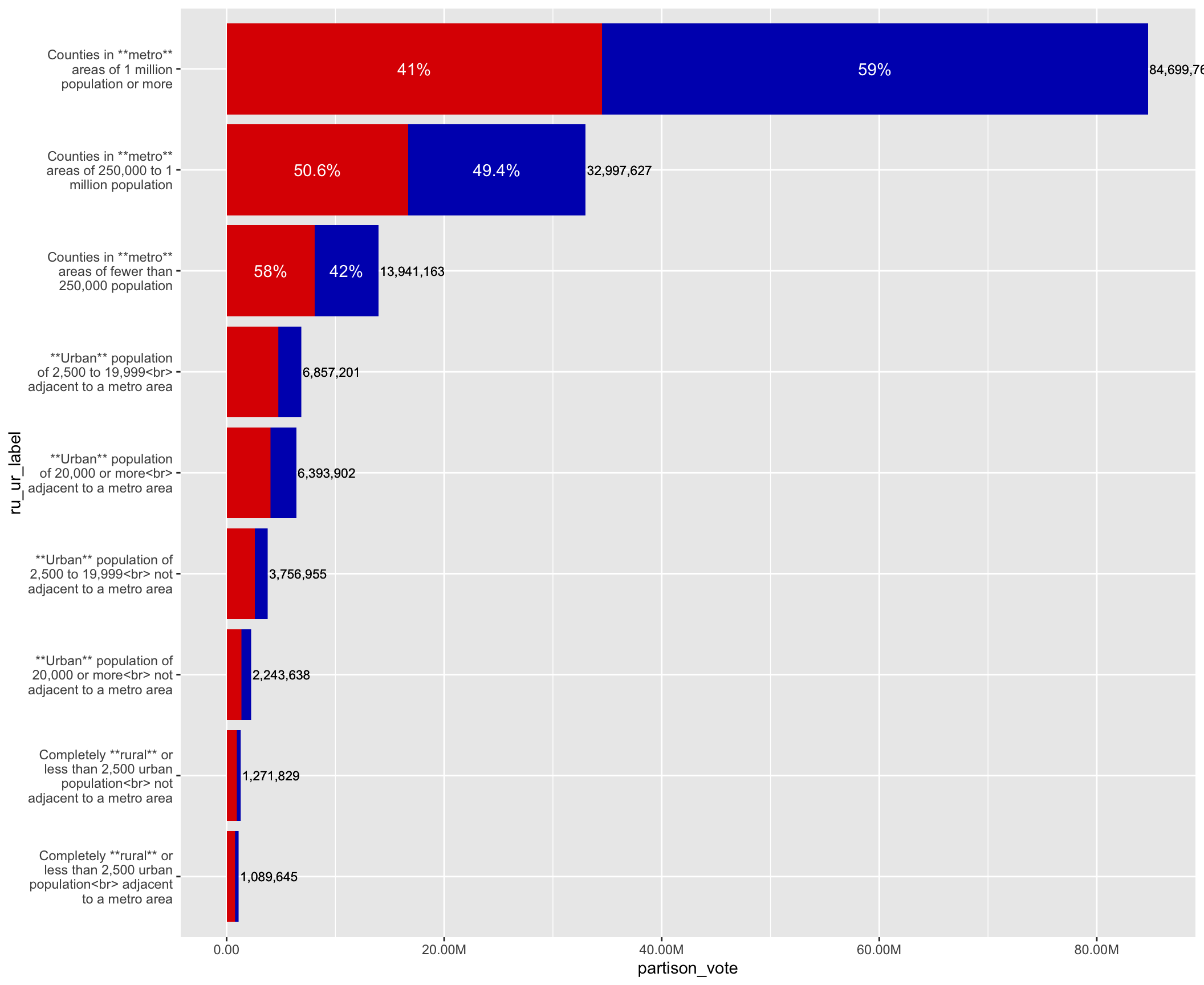
And finally, we add the a custom theme and some labels.
The ggtext package controls are specified in the plot theme.
We use the element_markdown and the element_textbox_simple to turn on the HTML and Markdown elements in the label text.
(ru_ur_partison_vote_gg <-
ru_ur_partison_vote_gg +
labs(
title = "<b>**US 2020 Elections by Rural-Urban Classification**</b><br>
Comparing <span style = 'color:#DE0100;font-size:24pt'>**Donald J. Trump**</span> & <span style = 'color:#0015BC;font-size:24pt'>**Joe R. Biden**</span>",
x = 'USDA Rural-Urban\nContinuum 2013',
y = 'Total Votes',
caption = 'Original data are from New York Times API.\nParsed by Fabio Votta (@favstats), and downloaded from https://github.com/favstats/USElection2020-NYT-Results.\nCreated by Elliot Meador (@Elliot_Meador).') +
post_theme(
axis.text.y = element_markdown(),
plot.title.position = "plot",
plot.title = element_textbox_simple(
size = 18,
lineheight = 1,
padding = margin(5.5, 5.5, 5.5, 5.5),
margin = margin(0, 0, 5.5, 0),
),
plot.margin = margin(2,2,2,2, 'cm')))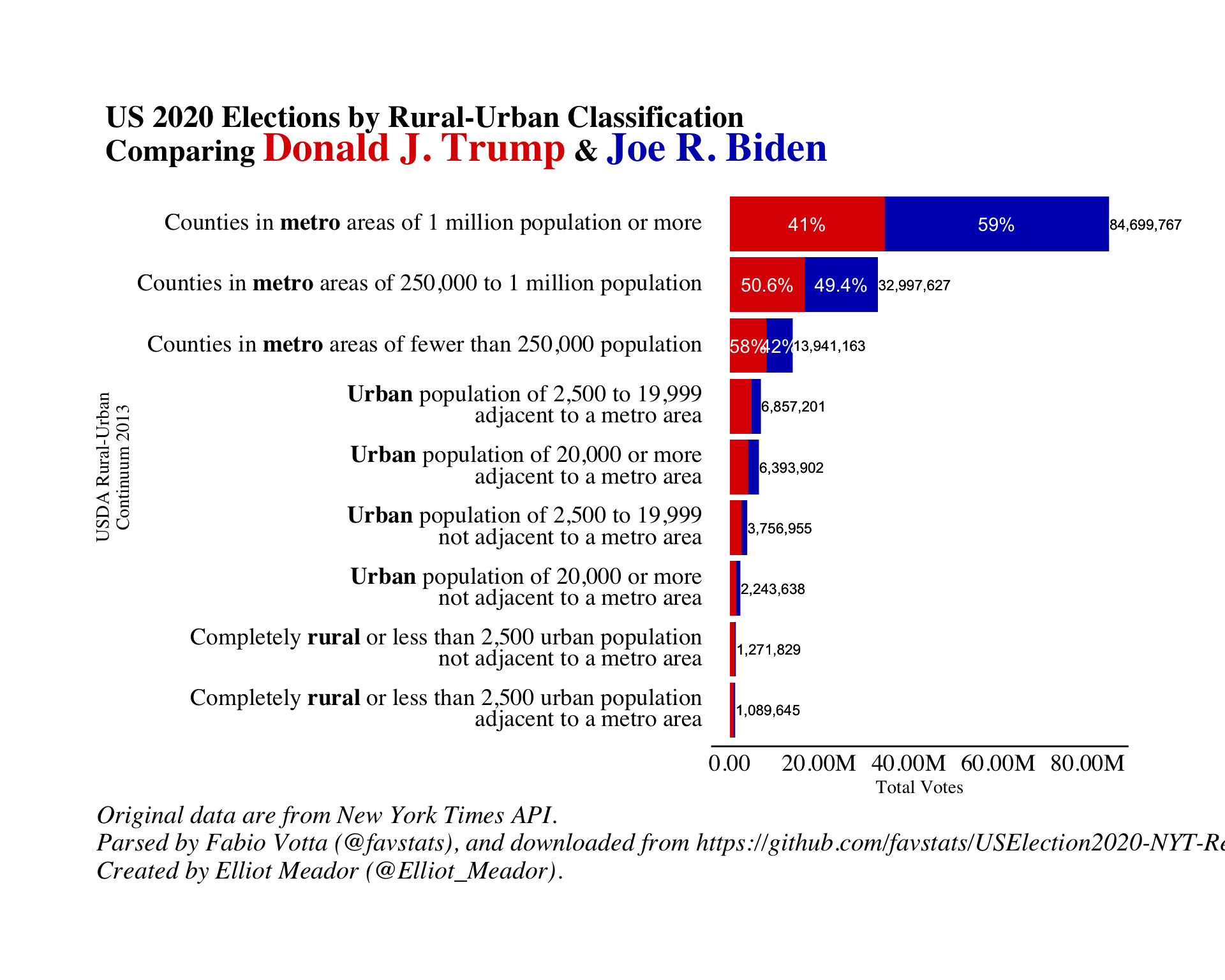 We can revisit our initial research questions and see that within rural areas there really isn’t enough people there to swing a national election.
Also, Trump won over 40% of the big metro areas in the US, and even higher in some urban areas.
More research is needed, but I personally don’t buy the argument that Trumps’ supporters are contained in rural areas only whilst Biden’s are found in the urban centres.
On the contrary, it a much more mixed bag for both parties.
We can revisit our initial research questions and see that within rural areas there really isn’t enough people there to swing a national election.
Also, Trump won over 40% of the big metro areas in the US, and even higher in some urban areas.
More research is needed, but I personally don’t buy the argument that Trumps’ supporters are contained in rural areas only whilst Biden’s are found in the urban centres.
On the contrary, it a much more mixed bag for both parties.
Elliot Meador PhD
Research Fellow
My research interests include community resilience, sustainable food systems and computational social science.