U.S. Food Deserts
Introduction
A considerable issue today related to food and rural population research are food deserts. Food deserts are a complicated issue, but the idea centres on a simple premise: areas, where it’s hard to reach a grocery store or access food, can be thought of as food deserts. If you’re interested in knowing more about the discourse on food deserts, I’d recommend looking into these papers:
- Blanchard, T. C., & Matthews, T. L. (2007). Retail concentration, food deserts, and food-disadvantaged communities in rural America. Remaking the North American food system: Strategies for sustainability, 201-215.
- Gundersen, C., Kreider, B., & Pepper, J. V. (2017). Partial identification methods for evaluating food assistance programs: a case study of the causal impact of SNAP on food insecurity. American Journal of Agricultural Economics, 99(4), 875-893.
- Andrews, M., Bhatta, R., & Ploeg, M. V. (2013). An alternative to developing stores in food deserts: can changes in SNAP benefits make a difference?. Applied Economic Perspectives and Policy, 35(1), 150-170.
The data
Data for this post is on food deserts and comes from Kaggle. Kaggle is an excellent resource for aspiring data scientists and experienced ones. Specifically, the page called Food Deserts in the US: Food access for sub-populations of the United States. You can download the data directly from the link in the sentence above. The code below reads in the data.
Libraries and data
# For data wrangling/tables
library(tidyverse)
library(janitor)
library(knitr)
library(kableExtra)
library(glue)
library(tidytext)
library(scales)

# For mapping and census data
library(tigris)
library(leaflet)
library(leaflet.extras)
library(maps)
library(sf)
library(widgetframe)
library(htmlwidgets)
library(htmltools)
map <- purrr::map

# US county and state fips data is built-in R
data("county.fips")
county.fips <-
 county.fips %>%
  as_tibble()

data("state.fips")
state.fips <-
  state.fips %>%
  as_tibble()


# File 1
food_access_research_atlas <-
  read_csv('~/Downloads/665808_1173338_bundle_archive/food_access_research_atlas.csv') %>%
  clean_names()

# File 2
lookup <-
  read_csv('~/Downloads/665808_1173338_bundle_archive/food_access_variable_lookup.csv') %>%
  clean_names()

# Pull in the USDA data from a directory I created in my cloud storage.
rural_urban <-
  read_csv('~/OneDrive - SRUC/Data/usda/ruralurbancodes2013.csv') %>%
  select(state,
         county = county_name,
         rucc_2013,
         desc = description)
Theme
We’ll use a custom theme for ggplot2 plots made with this code.
Note the ... notation, which allows us to make on-the-fly changes without calling another theme argument.
# a custom theme for ggplots
post_theme <- function(...) {
  theme(
    text =
      element_text(
        color = 'black',
         family = 'serif'),
    axis.text =
      element_text(
        color = 'black',
        size = 12.5),
    panel.background =
      element_blank(),
    axis.line.x =
      element_line(
        color = 'black'),
    axis.ticks = element_blank(),
    plot.margin = margin(.75, .75, .75, .75, 'cm'),
    plot.caption =
      element_text(hjust = 0,
                                face = "italic"),
    plot.title =
      element_text(
        face = 'bold'),
    plot.subtitle =
      element_text(face = 'bold'),
    plot.title.position = "plot",
    plot.caption.position =  "plot",
    strip.background =
      element_blank(),
    strip.text =
      element_text(
        face = 'bold')
  ) +
    theme(...) # this bit allows us to make changes using this same function instead of calling two theme functions.
}
An exciting caveat with the data is that it comes in two files. One file is the data, and the other file is what’s known as a data dictionary or data lookup. The lookup file is a database that explains what each variable is.
Linking with rural-urban classification data
There isn’t a perfect indicator of rural/urban classification in the data, so, as usual, we’ll need to add one. I’ve used the USDA Rural-Urban Classifications before in the post on Covid-19 and Rural Areas in the U.S..
# clean names will be used to help get joining data in format that will merge well
clean_names <-
  function(x){
    x <- str_to_lower(x)
    x <- str_remove_all(x, 'county')
    x <- str_remove_all(x, '[[:digit:]]')
    x <- str_squish(x)
    x <- str_trim(x)
    x
  }

rural_urban <-
  rural_urban %>%
  mutate(county = clean_names(county)) %>%
  rename(abb = state) %>%
  left_join(
tibble(abb = state.abb,
       state = clean_names(state.name)),
       by = "abb") %>%
  mutate(state_county =
           glue('{state} {county}')) %>%
  select(state_county, rucc_2013, desc)

rural_food_desert <-
  food_access_research_atlas %>%
  mutate(state = clean_names(state),
            county = clean_names(county),
            state_county =
                  glue('{state} {county}')) %>%
  left_join(rural_urban,
            by = 'state_county')
Working with lookup files - A closer look at SNAP
Lookup files are often called data dictionaries. Data dictionaries are a common component of many large datasets that are used extensively in the public sphere. As previously mentioned, quite often, a data dictionary or lookup is just another file that accompanies the primary data.
The data dictionary isn’t “data” in the traditional sense (i.e. we aren’t going to be performing cross-tabulations on it anytime soon), but it is a useful approach to treat it just like any other data file. For instance:
- We can append data dictionaries/lookups to the central database as we did previously;
- We can use natural language processing on the data dictionaries to get a better understanding of the data holds; and,
- We can use data tools like
dplyrandpurrrto pick apart the lookup file and make it more manageable.
Let’s say we are interested in looking at SNAP. SNAP is short for Supplemental Nutrition Assistance Program. According to the USDA’s website:
SNAP provides nutrition benefits to supplement the food budget of needy families so they can purchase healthy food and move towards self-sufficiency.
We can use dplyr and the kable function from knitr to quickly search and display the results for variables on SNAP.
lookup %>%
  filter(str_detect(description, 'SNAP')) %>%
  mutate(long_name =
           str_trunc(long_name, 10)) %>%
  kable(format = 'html', booktab = T) %>%
kable_styling()| field | long_name | description |
|---|---|---|
| lasnaphalf | Low acc… | Housing units receiving SNAP benefits count beyond 1/2 mile from supermarket |
| lasnaphalfshare | Low acc… | Share of tract housing units receiving SNAP benefits count beyond 1/2 mile from supermarket |
| lasnap1 | Low acc… | Housing units receiving SNAP benefits count beyond 1 mile from supermarket |
| lasnap1share | Low acc… | Share of tract housing units receiving SNAP benefits count beyond 1 mile from supermarket |
| lasnap10 | Low acc… | Housing units receiving SNAP benefits count beyond 10 miles from supermarket |
| lasnap10share | Low acc… | Share of tract housing units receiving SNAP benefits count beyond 10 miles from supermarket |
| lasnap20 | Low acc… | Housing units receiving SNAP benefits count beyond 20 miles from supermarket |
| lasnap20share | Low acc… | Share of tract housing units receiving SNAP benefits count beyond 20 miles from supermarket |
| TractSNAP | Tract h… | Total count of housing units receiving SNAP benefits in tract |
Glancing at the table above, one will quickly see nine variables cover SNAP benefits. Also, it appears that SNAP variables are often distinguished by have either number or share, which means that the variable has either total counts of percents of occurrence.
Let’s take a look at some and compare them by state.
We’ll use the verb contains within dyplyr to grab variables contain SNAP.
rural_food_desert_snap <-
  rural_food_desert %>%
  select(state, county, desc, census_tract, median_family_income,
         contains('snap'))
Getting things tidy
Before going forward we’ll need to tidy our data a bit.
Note the use of pivot_longer instead of spread; pivot_longer and pivot_wider are dplyr’s new verb names for changing between wide and long formats.
We won’t discuss the major changes here, but it’s good practice to read over big changes like this; you can do so here.
Once we have our data in a way that we like it let’s do some quick plots, first looking at state and county levels, then looking at rural-urban areas.
Travel distance
county_snap_dist <-
  rural_food_desert_snap %>%
  mutate(id = group_indices(., census_tract)) %>%
  select(state,
         county,
         desc,
         median_family_income,
         census_tract,
         contains('share')) %>%
  pivot_longer(-c(state,
                  county,
                  desc,
                  census_tract,
                  median_family_income),
               names_to =  'snap_dist',
               values_to = 'rate') %>%
  mutate(snap_dist =
           parse_number(snap_dist),
         snap_dist =
           replace_na(snap_dist, .5))
Let’s quickly take a look at the top rate (percent) of people in census tracts for each distance from a supermarket. In addition, we’ll consider the association between rate of SNAP recipients to income.
The plot below uses the stat_binhex in ggplot.
This approach is similar to a standard scatter plot, but it shows which areas of the plot have the highest frequency. This is important as the plot will have 124,326 points - far too many for a person to visual see the difference (due to overlapping with the points).
The stat_binhex function uses colour to differentiate the frequencies for each bin.
label_new <-
function(x){
glue('{x} miles to\nnearest supermarket')
}
county_snap_dist %>%
mutate(snap_dist = as.factor(snap_dist),
snap_dist = fct_relabel(snap_dist,
.fun = label_new)) %>%
filter(rate > 0) %>%
ggplot(aes(median_family_income, rate))+
stat_binhex()+
geom_smooth(color = '#CCCCCC',
method = 'gam')+
scale_fill_viridis_c(labels = comma,
name = '# of\ncensus tracts')+
scale_x_continuous(labels = dollar)+
scale_y_continuous(labels = percent,
expand = c(0, 0))+
facet_grid(~snap_dist, )+
post_theme(axis.text.x = element_text(angle = 45,
hjust = 1))+
labs(title = 'Association between SNAP rate and family income by travel distance to supermarket',
x = 'Median family income\nper census tract',
y = 'Percent SNAP\nrecipient',
caption = 'Smoothed line fits a generalized additive model (GAM) to data: y ~ s(x, bs = "cs").')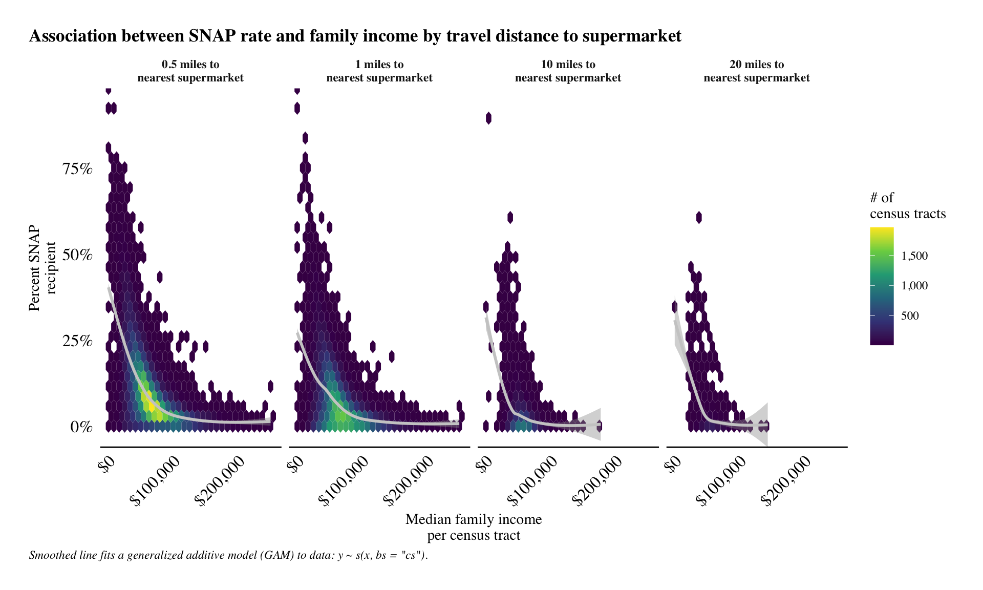 According to plot above, we can see that there is a relationship between median family income and percentage of SNAP usage.
Interestingly, but ultimately out of scope for this project, is the high percentage of SNAP recievers in places with high median family income values ($100k or more).
We see this because both SNAP and median family income are measurements of central tendency within a geography.
They are not 1-to-1 comparisons.
That is, we aren’t looking at survey data completed by individual people.
This finding alone tells us that it is necessary to look deeper into SNAP, as families who recieve the benefit may live quite unique lives, each with their own struggles to overcome.
According to plot above, we can see that there is a relationship between median family income and percentage of SNAP usage.
Interestingly, but ultimately out of scope for this project, is the high percentage of SNAP recievers in places with high median family income values ($100k or more).
We see this because both SNAP and median family income are measurements of central tendency within a geography.
They are not 1-to-1 comparisons.
That is, we aren’t looking at survey data completed by individual people.
This finding alone tells us that it is necessary to look deeper into SNAP, as families who recieve the benefit may live quite unique lives, each with their own struggles to overcome.
Building interactive maps
Our data is aggregated by census tract and is therefore geographical by nature. Mapping in R has made considerable developments in the past 5 to 10 years, and any work with rural/urban analysis can usually be benefited through some geospatial analysis. So learning to make maps is always helpful!
Leaflet maps
The leaflet package is a fantastic way to make interactive maps with a relatively small amount of code.
It works really well will with the sf package for geo-computational analysis.
Moreover, we can use the tigris package to get census tract information straight in R.
tigris can return sf objects, making for speedy workflow between the three packages.
Below, we’ll take a look those census tracts that have a large proportion of the population that have to travel 20 or miles to a supermarket and that have a high percentage of SNAP recipients.
## Get all 20 miles or more that have at least some percent of SNAP users
top_perc_20m <-
  county_snap_dist %>%
  filter(snap_dist == 20,
         rate > 0) %>%
  mutate(desc = replace_na(desc, 'Unknown'))


top_perc_20m_ls <-
  top_perc_20m %>%
  mutate(id = as.character(row_number())) %>%
  split(.$id)


# retrieve all census tract polygons per county using a loop and the applying the tracts function from the tigris package.

top_perc_20_sf_ls <-
  map(top_perc_20m_ls,
      possibly(function(x){
        .y <-   tracts(state = x$state,
                       county = x$county,
                       cb = T)

        single_track <-
          str_sub(x$census_tract,
                start = 6,
                end = 9)

        .z <- .y %>%
          filter(NAME %in% single_track)

        .z$census_tract <- x$census_tract
        .z$rate <- x$rate
        .z$dist <- x$snap_dist
        .z$desc <- x$desc
        .z$id <-  x$id
        .z$county <-  x$county
        .z$state <-  x$state
       .z$median_family_income <-x$median_family_income

        return(.z)

      }, NULL))

# NOTE do.call to combine the sf objects
top_20_sf <-
  do.call(rbind,top_perc_20_sf_ls)

# This whole code-block may take quite a bit of time to run depending on your computer's specs. It's best to go ahead and save the output and then comment out the code above. This reduces the risk of accidently changing or re-running things, then having to wait to make adjustments.

write_sf(top_20_sf,'~/Documents/temp/top_20_sf.shp')
It only takes a few lines of code to produce a great map in leaflet.
Below you can see the polygons of the top 25 SNAP recipients in food deserts that are 20 miles or more to supermarkets.
And, while it is inciteful in its own right, it leaves us wanting something more.
With the help of HTML, we can turn this map into something fantastic!
leaflet(top_20_sf) %>%
  addProviderTiles("CartoDB.Positron") %>%
  addPolygons(color = "tomato") %>%
  frameWidget()
Leaflet to the next level
One way to dramatically improve our interactive leaflet maps is to use HTML code. HTML is essential a coding approach to formatting web applications.
Officially HTML is:
Hypertext Markup Language (HTML) is the standard markup language for documents designed to be displayed in a web browser. It can be assisted by technologies such as Cascading Style Sheets (CSS) and scripting languages such as JavaScript.
We’ll also use CSS, which is similar to HTML in that it’s used to format websites. Officially, CSS is:
CSS stands for Cascading Style Sheets. CSS describes how HTML elements are to be displayed on screen, paper, or in other media. CSS saves a lot of work. It can control the layout of multiple web pages all at once. External stylesheets are stored in CSS files.
We can also use our data to correspond to map polygon colours.
The leaflet.extras package offers a lot of great extra options to add to leaflet maps.
The best part is that it is relatively straightforward to add these options.
Let’s take the following steps to trick out our leaflet map!
- We’ll use
HTMLto create some tooltips that provide users information when they hover over polygons in the map. - Create a custom function to map the fill/colour of the
leafletpolygons to help guide the user’s eye towards the worst off places in terms of SNAP and distance to supermarket. NOTE: Our custom colour function is from this question on StackOverflow.com. - Use
leaflet.extrasto add some great functionality that makes the map more user-friendly. - Create and format a title using CSS.
remove_words <-
  glue_collapse(c('Nonmetro - ',
                  'Metro - '),'|')

## tooltip with html
tooltip <- top_20_sf %>%
  as_tibble() %>%
  mutate(county = str_to_title(county),
         state = str_to_title(state),
         rate = round(rate, 2),
         rate = percent(rate),
         desc = str_remove_all(desc,
                               remove_words),
         median_family_income =
           dollar(median_family_income)) %>%
  transmute(tip = glue('<b>County:</b> {county} <br> <b>State:</b> {state} <br> <b>*SNAP percent:</b> {rate} <br> <b>**Rural/Urban class:</b> {desc} <br> <b>Median family income:</b> {median_family_income} <br><b>Tract:</b> {census_tract}<br><br>* All areas have this percentage SNAP recipients who 20 or more miles from a supermarket.<br>** Rural/Urban classification determined at county-level.'))

# change polygon colour to correspond to a numeric variable in the database
map2color <- function(x,
                      pal,
                      limits = NULL) {
  if (is.null(limits))
    limits = range(x)
  pal[findInterval(x,
               seq(limits[1],
               limits[2],
               length.out = length(pal) + 1),
                   all.inside = TRUE)]
}

col_pal <- rev(viridis_pal()(6))

all_rate <- top_20_sf %>%
  as_tibble() %>%
  pull(rate)

all_rate_0 <-
  ifelse(all_rate < 0.005, 0, all_rate)

all_rate_6 <- cut_interval(all_rate_0,
                           6,
                           labels = F)

percent_labs <- c('0.0% to 10.1%',
  '10.1% to 20.2%',
  '20.2% to 30.2%',
  '30.2% to 40.3%',
  '40.3% to 50.4%',
  '50.4% to 60.5%')

## Add a our title to the map using css

tag.map.title <- tags$style(HTML("
  .leaflet-control.map-title {
    transform: translate(-50%,20%);
    position: fixed !important;
    left: 50%;
    text-align: center;
    padding-left: 10px;
    padding-right: 10px;
    background: rgba(255,255,255,0.5);
    font-weight: bold;
    font-size: 28px;
  }
"))

title <- tags$div(
  tag.map.title, HTML("US Food Deserts")
)


top_20_sf_leaf_map <-
    leaflet(top_20_sf) %>%
  addProviderTiles("OpenStreetMap") %>%
  addPolygons(color = '#C4C4C4',
              fillColor  =
                map2color(all_rate_6,
                          col_pal),
              fillOpacity = .85,
              weight = .55,
              popup = tooltip$tip,
          opacity = 1
          )%>%
  addDrawToolbar(
    editOptions=editToolbarOptions(selectedPathOptions=selectedPathOptions())
  ) %>%
  addLegend(colors = col_pal,
            labels = percent_labs,
            opacity = 0.7,
            title = 'Percent SNAP use<br>by census tract',
    position = "bottomright") %>%
  addControl(title,
             position = "topleft",
             className="map-title")

top_20_sf_leaf_map %>%
frameWidget(width = '100%')leaflet map now has plenty of bells and whistles, and hopefully, it will be useful for people interested in knowing more about food deserts and SNAP in the US.
Conclusion
Food deserts and SNAP are complicated subjects in their own right. Very often, the two compound one another, making things even more complicated. Using data science approaches to thinking about these two issues can help policymakers and rural stakeholders better plan for those people impacted by them.
As always, the Deltanomics blog is for instructional use in R. Any potential findings need more research to verify them before any conclusions can be made.
Elliot Meador PhD
Research Fellow
My research interests include community resilience, sustainable food systems and computational social science.