Apples for apples I
Introduction
This is the initial Deltanomics blog post. So, in this post, I’ll cover a few different approaches to analysis and data visualisation rather quickly that provides a good overview of the types of things covered in this blog.
Let’s start with loading the packages we’ll use. Also, let’s create a ggplot theme that allows us to easily make changes when we want.
## Libraries used in analysis
library(tidyverse)
library(magrittr)
library(scales)
library(RColorBrewer)
library(janitor)
library(ggraph)
library(tidygraph)
library(graphlayouts)
library(flextable)

## a congruent theme throughout for plots
post_theme <- function(...){
  theme(text = element_text(color = 'black',
                            family = 'serif'),
        axis.text = element_text(color = 'black'),
        panel.background = element_blank(),
        axis.line.x = element_line(color = 'black'),
        axis.ticks = element_blank(),
        plot.margin = margin(.5, .5, .5, .5, 'cm'),
        plot.caption = element_text(hjust = 0,
                                    face= "italic"),
        plot.title = element_text(face = 'bold'),
        plot.subtitle = element_text(face = 'bold'),
        plot.title.position = "plot",
        plot.caption.position =  "plot") +
          theme(...) # this bit allows us to make changes using this same function instead of calling two theme functions.
        }
Data source
We’re going to look at some FAO data on apples. It comes from the FAO’s online data portal, which can be accessed here. The website allows users to specify the varibles they want to analysis and download them into a .csv file. This makes working with the data a breeze using the tidyverse. Let’s first take a quick look at the data.
We use read_csv from the readr package (included in the tidyverse library) and the function clean_names from the janitor package. clean_names does exactly what it says it does – cleans up a dataframe/tibbles’s variable names so that they are easy to use in analysis.
apples <- read_csv('/Users/emeador/Downloads/FAOSTAT_data_1-1-2020.csv') %>% clean_names()Data Analysis
General analysis
Let’s do some really quick data analysis to get a feel of what the data works with. From there we’ll move on towards looking at apple supply chain. A quick bar plot shows the top 20 exporting countries.
apple_export_total <- apples %>%
  filter(element == 'Export Quantity',
         flag_description == 'Official data')%>%
  group_by(reporter_countries) %>%
  summarise(total = sum(value, na.rm = T)) %>%
  mutate(reporter_countries=fct_reorder(reporter_countries,total))

apple_export_total %>%
  top_n(20) %>%
  ggplot(aes(reporter_countries, total))+
  geom_col(fill = '#ff0800')+
  scale_y_continuous(expand = c(0,0), labels = comma)+
  coord_flip()+
  post_theme()+
  labs(title = 'Top 20 countries that export apples in 2017', subtitle = ' SOURCE: FAO Detailed trade matrix', x = NULL, y = 'Tonnes', caption = 'NOTE: Only official data shown')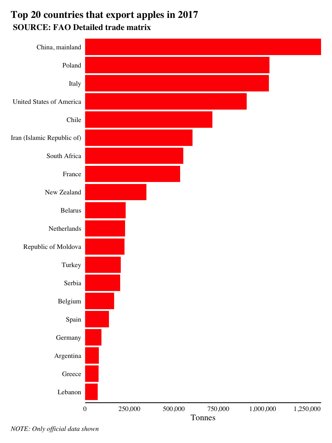
China, mainland is the highest exporter of tonnes of apples in 2017 according to the data with 1,328,374 tonnes of apples exported.
Let’s take a look at the top importers of apples to the UK. We can adapt the code above to create a bar plot that filters by the variable parter_countries, which we’ll set to filter for United Kingdom using the == operator.
UK_import <- apples %>%
  filter(element == 'Export Quantity',
         partner_countries == 'United Kingdom',
         flag_description == 'Official data') %>%
  group_by(reporter_countries) %>%
  summarise(total = sum(value, na.rm = T)) %>%
  mutate(reporter_countries = fct_reorder(reporter_countries, total)) %>%
  top_n(20)

UK_import %>%
  ggplot(aes(reporter_countries, total))+
  geom_col(fill = '#ff0800')+
  scale_y_log10(expand = c(0,0), labels = comma)+
  coord_flip()+
  post_theme()+
labs(title = 'Where does the UK get its apples from?', subtitle = ' SOURCE: FAO Detailed trade matrix', x = NULL, y = 'log10(Tonnes)', caption = 'NOTE: Only official data shown') 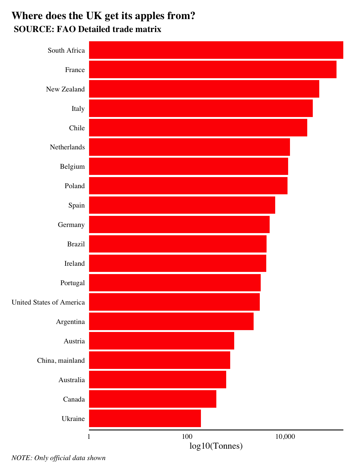
The UK imported 444,906 tonnes of apples in 2017. Over a quarter of all apples imported to the UK came from France and other European countries. So they didn’t have to travel too far. However, the largest and third largest imports came from South Africa and New Zealand, i.e. they traveled halfway across the world!
Of course, it’s common for goods to travel great distances in today’s global economy. This of course impacts sustainability as traveling across the world increases the carbon output. And while a total carbon assessment is out of the scope of this post, we can use network analysis to help better our understanding of how the global apple supply chain operates and where the UK sits in it all.
Network analysis
We need to create an igraph object in R from our apples tibble to work with. The easiest way to do this is to create an edgelist from our data. An edgelist is a two-column list of nodes where adjacent nodes form an edge. igraph and by extension tidygraph will create graphs with dataframes that an edgelist in their first two columns. The remaining columns will be used as edge attributes.
reporter_countries | partner_countries |
Greece | Bahrain |
Germany | Cyprus |
Ireland | Australia |
Poland | Armenia |
Brunei Darussalam | Japan |
Egypt | Turkey |
Austria | Malta |
Poland | Republic of Moldova |
Lebanon | New Zealand |
Denmark | Ireland |
The code below creates a graph and plots it using ggraph.
aph <- apples %>%
filter(element == 'Export Quantity',
flag_description == 'Official data') %>%
select(reporter_countries, partner_countries, value) %>%
as_tbl_graph()
aph %>%
mutate(degree = centrality_degree()) %>%
ggraph('stress')+ # specify the DH layout
geom_edge_fan(aes(alpha = ..index..),
color = '#654321',
show.legend = F)+
geom_node_point(aes(size = degree),
color = '#00c400')+
scale_size(range = c(1, 2.5),
name = '# different countries\n that exporting apples')+
coord_equal()+
theme_graph(foreground = T)+
labs(title = 'The apple supply chain ... hairball',
caption = 'Without much formatting, the network is complicated and unreadable.\nThe look is characteristic of the hairball that sometimes occurs in network visualisations.')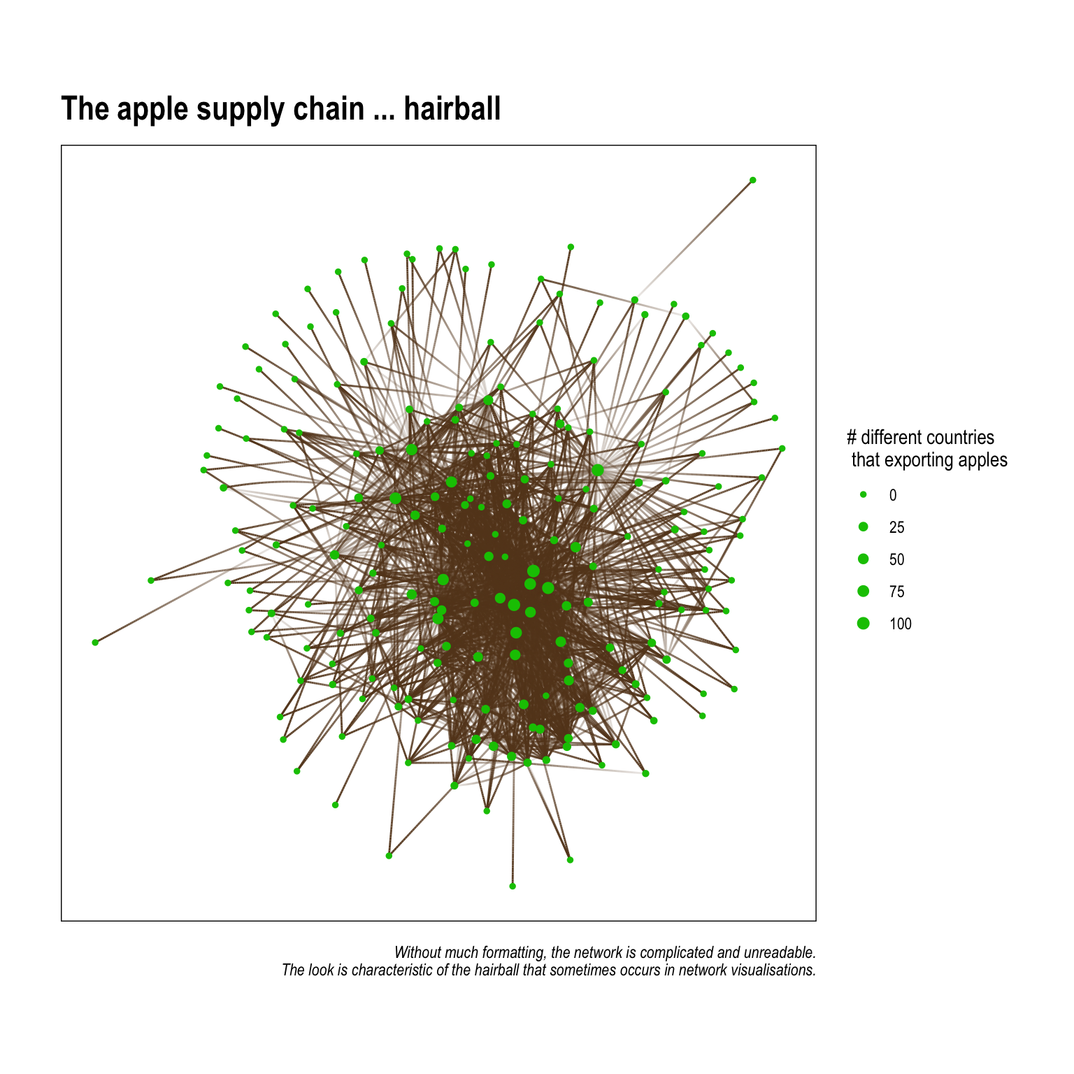 The graph above is utterly unintelligable, and shoudn’t really appear in something you plan to publish. There are few things we can do to make the graph easier to understand when visualised. They are:
- Remove unnessary edges – this serves a few purposes: it frees up some of the clutter that comes from having too many lines on the plot; but, another lesser known thing is that it actually affects the underlying
layoutalgorythim We’ll get into this in another post, but, in short, layout algorythims (usually) attempt to group nodes together in a way that reduces overlapping edges. Fewer edges can mean the nodes are spaced in a way so that naturally occuring patterns in connectivity are more easily seen. - Identify and showcase interesting patterns – network graphs are often made better when they illustrate specific patterns that a researcher has previously identified through visualising the data or running statistical analysis. This is similar to plotting percents or sums using bars graphs – you choose the plot style (think geom_*’s in
ggplot2) that corresponds to what you want to showcase!
The following code creates an edgelist in the form of a tibble that has each county's top 2 exporting countries (the two countries where it send the most apples). This greatly reduces the number of edges and allows more nuanced findings in terms of apple trading patterns to emerge.
UK_neighborhood_1 <-
  aph %>%
  to_local_neighborhood(node = 85, order = 1, mode = 'in')%>%
  .[[1]] %>%
  activate(edges) %>%
  group_by(from) %>%
  top_n(2, value) %>%
  activate(nodes) %>%
  mutate(degree = centrality_degree())

 UK_neighborhood_1 %>%
  ggraph()+
  geom_edge_fan(aes(alpha = value),
                color = '#654321',
                width = 1.25,
                arrow = arrow(length = unit(2.5, 'mm'),
                              type = 'closed'),
                end_cap = circle(5, 'mm'))+
  geom_node_label(aes(size = degree,
                      label = str_wrap(name, 10)),
                  color = '#ff0800',
                  show.legend = F)+
  scale_size(range = c(2, 3))+
   scale_edge_alpha(range = c(.5, 1),
                    labels = comma)+
   scale_edge_width_continuous(range = c(.5, 1.5))+
  coord_equal()+
  theme_graph(foreground = T)+
  labs(title = 'The UK\'s 1-degree apple supply neighborhood',
       caption = 'Only the top-two export destinations are shown per country. All nodes have exactly two out-degrees.\nSome nodes have in-degrees because they happen to be another country\'s top-two imports.')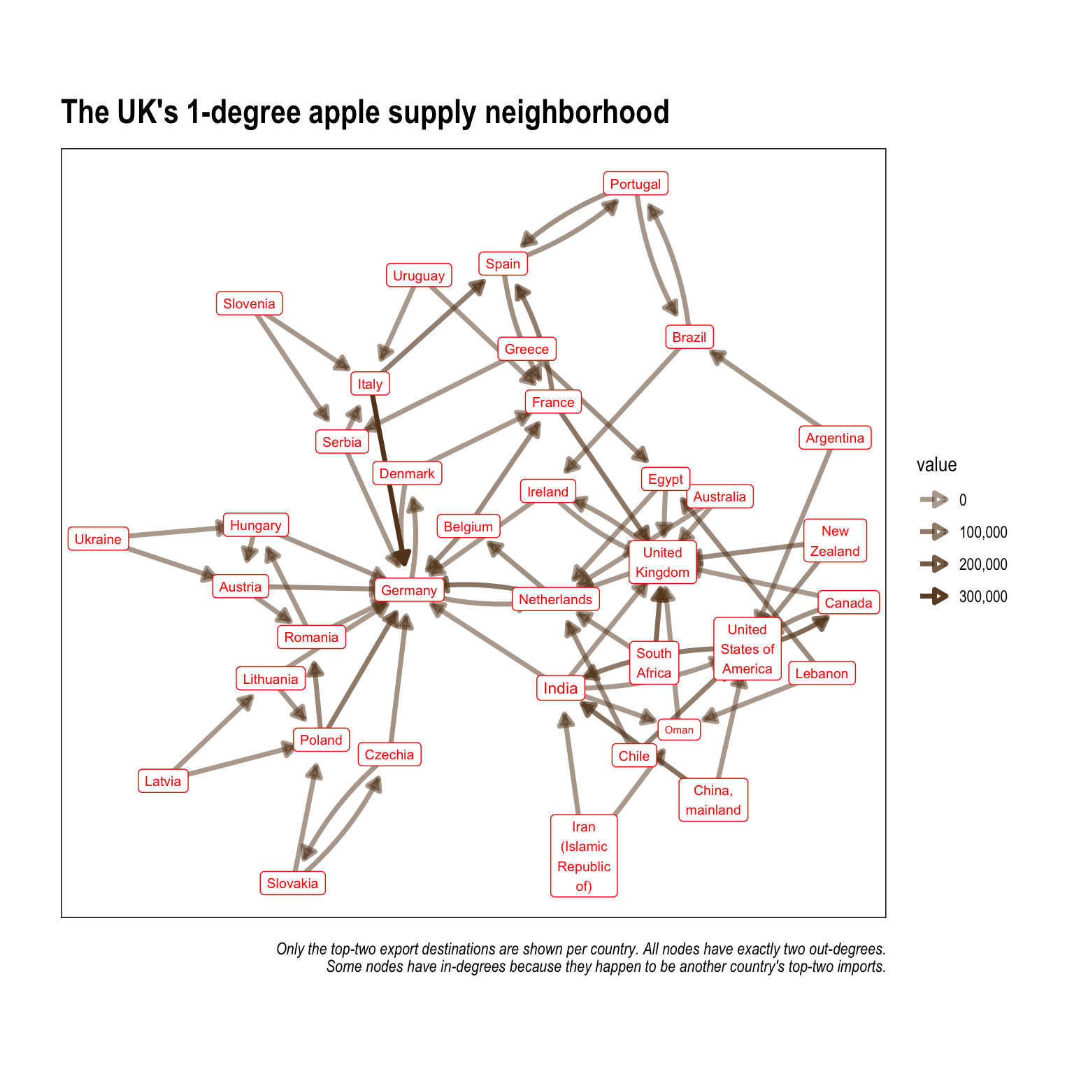
Visualising travel distance
A quick base-map of the world
We can draw on existing online resources to help us prepare a base map of the world using ggplot and a (newish) file type called simple features sf. Here is a great resource on mapping and spatial analysis in R using ggplot2 by Mel Moreno and Mathieu Basille. I highly recommend checking it out. sf are my prefered object types to work with in R when doing any type of mapping or spatial analysis. The map is projected using the Equal Earth projection to help readers more easily see the network edges (when they are plotted).
Let’s take a look at a world map that we can use as a base for the network plot. We’ll use the rnaturalearth and rnaturalearthdata packages to provde parameters and data as sf objects, and we’ll plot the map in ggplot2. ggplot2 and ggraph can objects can be stacked on top of one another to create a flowing network map.
library(rnaturalearth)
library(rnaturalearthdata)

countries <- ne_countries(returnclass = "sf")


graticules <- ne_download(type = "graticules_15",
                          category = "physical",
                          returnclass = "sf")
## OGR data source with driver: ESRI Shapefile
## Source: "/private/var/folders/ck/v11m55r567d9z7ql_1vvdy600000gn/T/Rtmpb9TTSG", layer: "ne_110m_graticules_15"
## with 35 features
## It has 5 fields
## Integer64 fields read as strings: degrees scalerankbound_box <- ne_download(type = "wgs84_bounding_box",
category = "physical",
returnclass = "sf")## OGR data source with driver: ESRI Shapefile
## Source: "/private/var/folders/ck/v11m55r567d9z7ql_1vvdy600000gn/T/Rtmpb9TTSG", layer: "ne_110m_wgs84_bounding_box"
## with 1 features
## It has 2 fields(base_world <- ggplot() +
geom_sf(data = bound_box,
col = "grey20",
fill = "transparent") +
geom_sf(data = countries,
aes(fill = sovereignt),
color = 'grey',
lwd = 0.3,
show.legend = F) +
scale_fill_viridis_d(direction = -1)+
post_theme(legend.position = 'bottom',
legend.background =
element_rect(fill = 'grey95',
color = 'black'))+
theme(plot.title = element_text(size = 24,
face = 'bold'),
axis.text = element_blank())+
labs(title = 'World Map',
caption = 'Projected with the Equal Earth map projection '))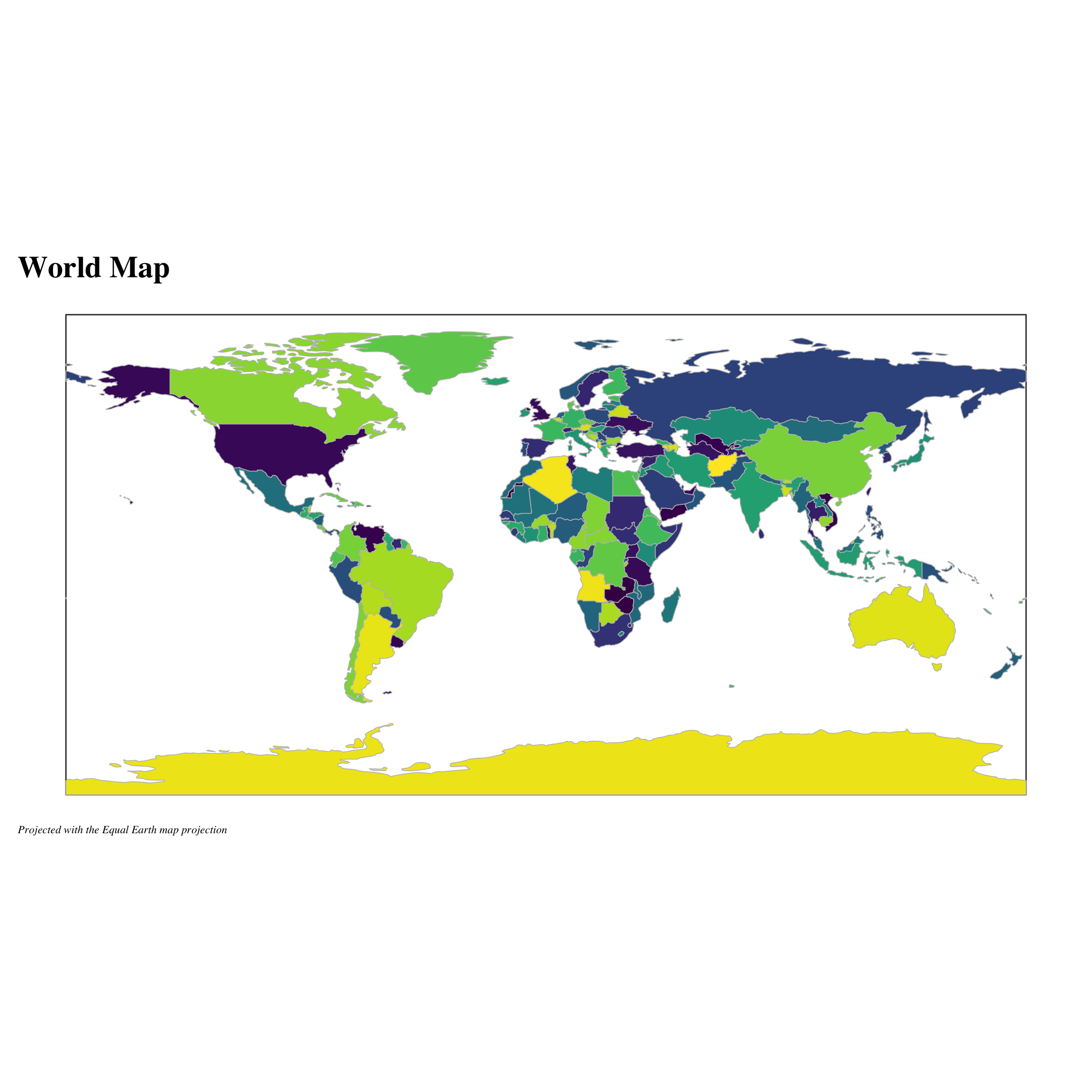
Combining the basemap and network graph
In preparation for our supply chain we need to calculate the node positions for each country. A good starting point is to use a polygon’s centroid points. A polygon centroid is the mathmatical centre of mass. Which means that it’s slightly different that the mean of longitude and latitude. The unique and non-uniform shapes of most policital boundaries mean that centre-mass locations are usually preferred. We can use the ‘st_centroid’ function from the ‘sf’ package to calculate the centroids for every country in the world. We’ll save this as ‘country_centroids’.
# get centroids
country_centroids <- countries %>%
  sf::st_centroid() %>%
  as_tibble() %>%
  select(name, geometry) %>%
  mutate(geometry  = as.character(geometry)) %>%
  separate(geometry, c('x', 'y'), sep = ',') %>%
  mutate_at(vars(x, y), list(~parse_number(.)))


# a little cleaning of a few countries to
# ensure that they merge properly.
node_centroids <- UK_neighborhood_1 %>%
  as_tibble() %>%
  select(name) %>%
  mutate(name = case_when(
    str_detect(name, 'China') ~ 'China',
    str_detect(name, 'Iran') ~ 'Iran',
    str_detect(name, 'Czechia') ~ 'Czech Rep.',
    str_detect(name, 'United States of America') ~
      'United States',
    T~name
  )) %>%
  left_join(country_centroids)

layout_centroid <- node_centroids %>%
  select(-name)
Finally, we’ll use ggraph to make the final plot. We use a layered approach and add some geom_sf’s to input the background world map.
# start with a ggraph
ggraph(UK_neighborhood_1,
         layout = layout_centroid)+
    geom_sf(data = bound_box,
          col = "grey20",
          fill = "transparent") +
  geom_sf(data = countries, ## add the geom_sf to map
          aes(fill = sovereignt),
          color = 'grey',
          lwd = 0.3,
          show.legend = F)+
  geom_edge_arc(arrow = arrow(type = 'closed', # add geom_edge for edges
                              length = unit(1, 'mm')),
                width = .75,
                color = 'black',
                end_cap = circle(1.25, 'mm'),
                alpha = .75,
                strength = .15)+
  post_theme(legend.position = 'bottom',
             legend.background =
               element_rect(fill = 'grey95',
                            color = 'black'))+
  scale_fill_viridis_d(direction = -1)+
  theme(plot.title = element_text(size = 24,
                                  face = 'bold'),
        axis.text = element_blank())+
  labs(title = 'Apples for apples',
       subtitle = 'UK first degree network',
       caption = 'Projected with the Equal Earth map projection ')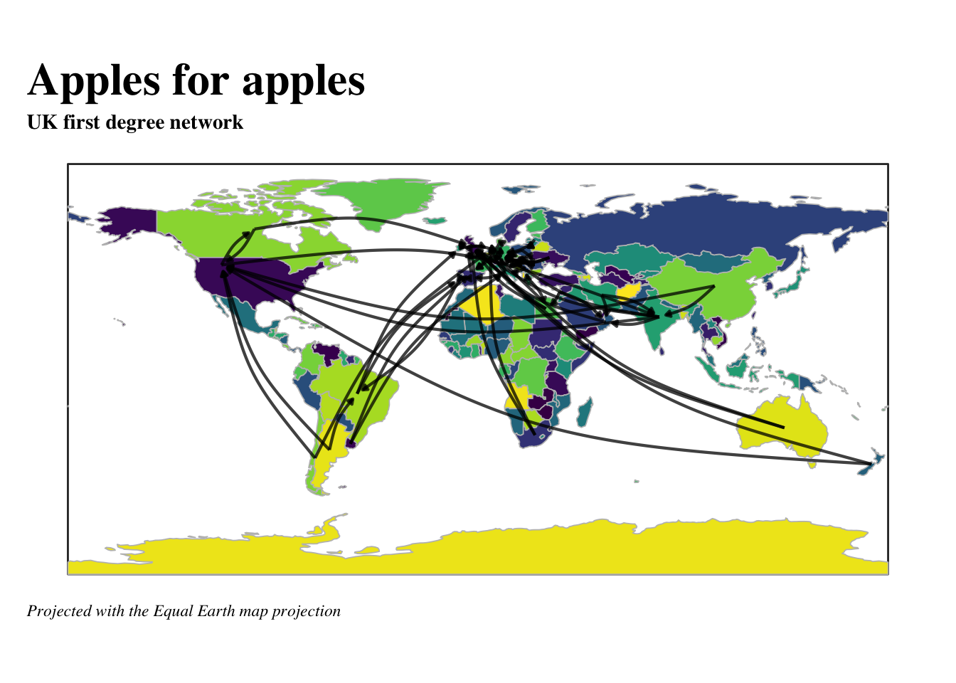
Elliot Meador PhD
Research Fellow
My research interests include community resilience, sustainable food systems and computational social science.